Client’s Challenge.
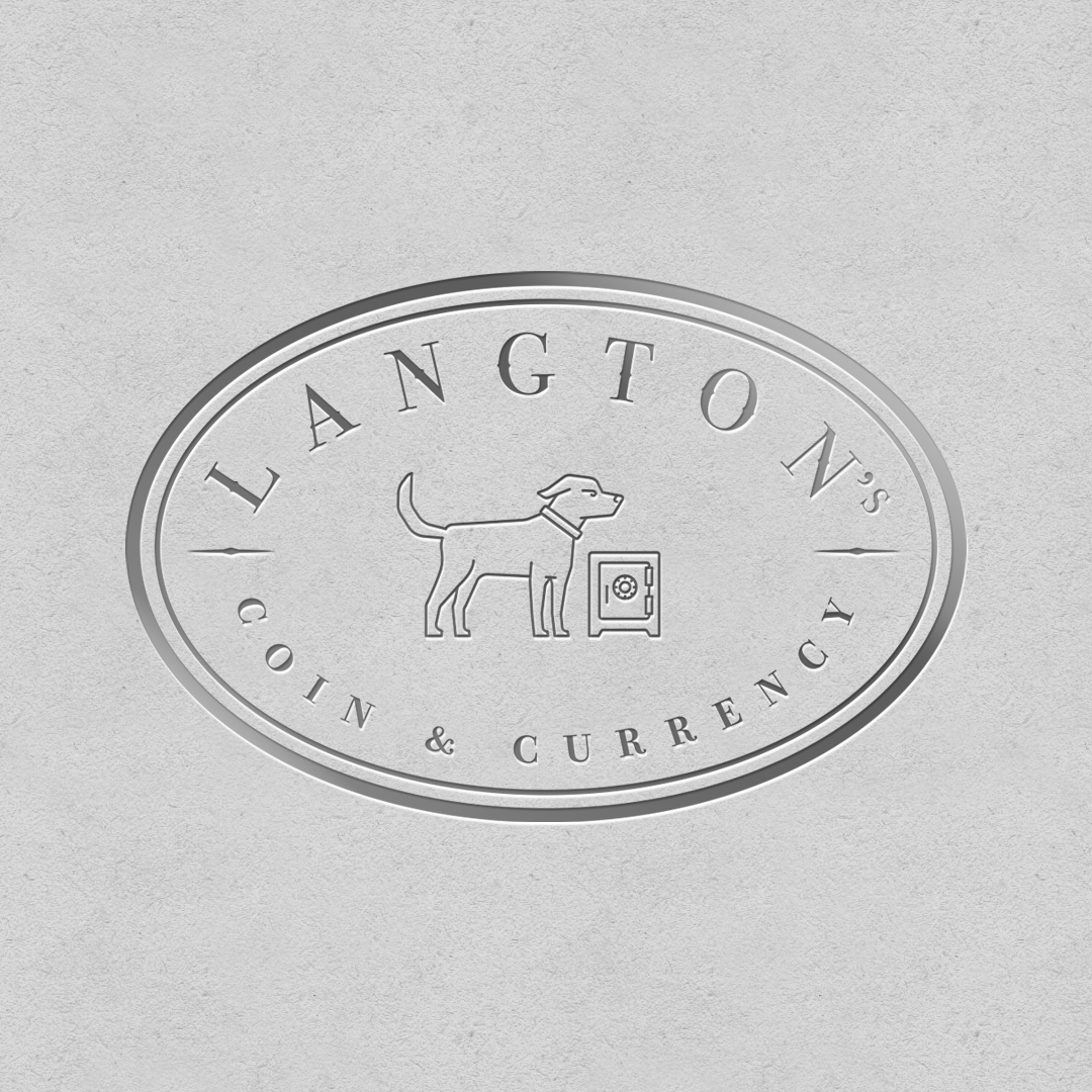
When we first stepped on to curate the Langton’s Rare Coin and Currency brand mark we were posed with a primary challenge. The first use case for this design would be turning the logo mark into a stamp, that could be impressed directly into silver bars. This request is a wonderfully unique and specific use case for any logo mark design, and an important design constraint pertaining to this project. The way this use case challenged the design process is perimeters of finding the right concept and illustrating it in a way that would not be too complex. Small lines or extreme detail would unfortunately blur and distort metal takes the impression of a stamp into its surface.
The Concept.
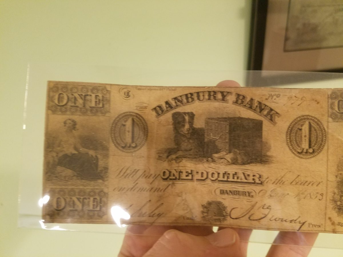
With any logo mark, the first challenge, beyond keeping it simple and clearly illustrated, is figuring out what the heck the symbol or avatar actually is. Fortunately, this client knew right away what they wanted to see, their idea was a blend of a historically significant design idea married with a special personal touch. We were presented with a historic design from an old bank note from the City of Danbury, a guard dog, sitting near a safe, in that old world hand-etched illustration style. Nothing says protection better than the safe itself, add the guard dog and you’ve got a perfect blend of ideas to tint the thoughts of any viewer, that this brand is about money, and the protection of wealth.
The Illustration and References.
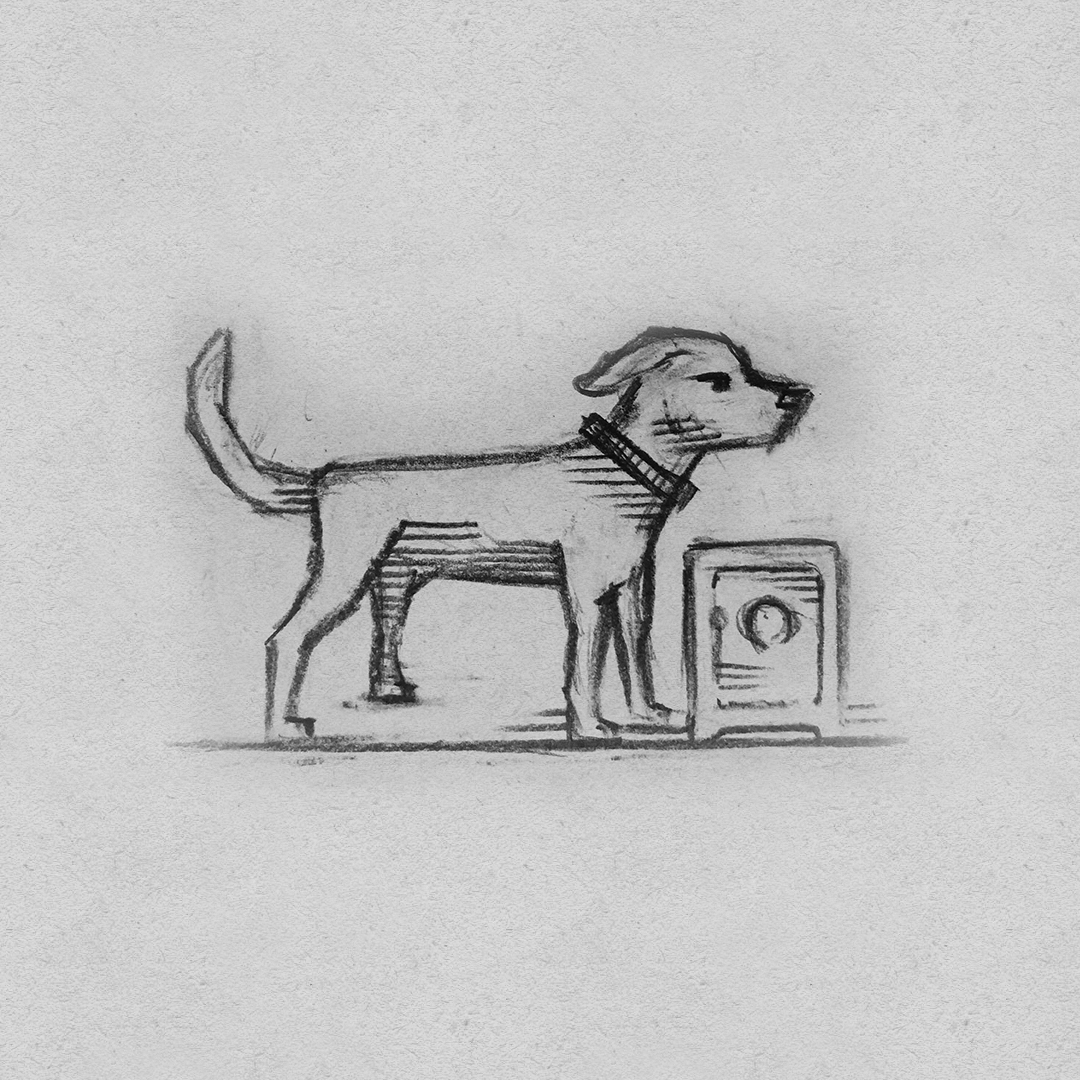
We start every logo mark process with the time tested step-by-step work flow that we’ve employed in every logo, including pencil sketches and lots of research. We do not want to copy anyone else’s brand, or jump in line anything that’s overly obvious.
We hit the open web to find imagery of the objects we want to bring into the design, and with out the confines of software we pull out pad and pencil and begin to explore layouts and shapes. Because the owners at Langton’s have a background in art and decades of experience collecting rare coins and bills, they were able to provide a direct reference of a concept design that inspired them. At the same time, the owner’s actual pet became an additional inspiration for what kind of avatar might find its way into the design. Concept and a little bit of personal meaning can give a logo mark a great little story, perfect topic for an ice breaker in any commercial exchange.
Once we have the idea, a few sketches, we then run rounds of edits and critiques with the client to arrive at what we agree would be the final mark. With each logo mark, we go through a step-by-step and round-by-round process of changes and alterations to find just the right layout, concept, and typography.
We are so very pleased where this design ended up, we decided to write a case study about it! Stay tuned for more media released on this brand mark as it starts to get used in their marketing.
Contact us for a complimentary first call and consultation.


